A Whole House Furniture Color Scheme with Room for Different Personalities
A green sofa in the living room and a yellow bed upstairs can belong in the same home. The connection usually comes from the surrounding materials, the balance of light and dark, and what you see between rooms. A whole house furniture color scheme works best when it gives each purchase a place in the larger picture without making every room repeat the same combination.
For a home being furnished in stages, start with the finishes that are staying and the largest new upholstered pieces. HEZEN CASA's olive chenille sofa, off-white linen modular sofa and mustard linen bed offer three quite different starting points. Decide where each colour belongs before adding the cabinets, rugs and smaller furniture that will sit around it.
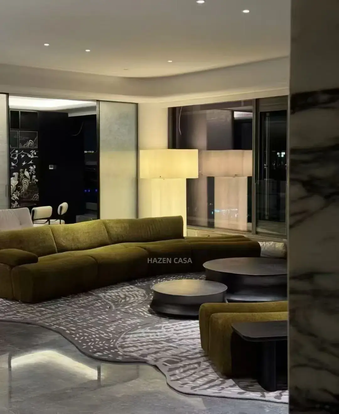
Build the whole house furniture color scheme from the views between rooms
Stand at the entrance to each main space and take a photograph towards the next one. A living room that opens directly onto dining needs a closer colour relationship than a bedroom behind a closed door. Mark the furniture visible in those views. That is the group you need to judge together, even if the pieces appear on separate room schedules.
Keep the floor, doors, kitchen fronts and any retained stone in the comparison. A sofa can look neutral against a white studio background and noticeably warm beside a cool floor. The first useful decision is whether the new furniture will continue the existing warmth or introduce a deliberate contrast. There is no need to force a near match that looks accidental.
For a designer furnishing a villa, the entrance view might include the end of a living-room sofa and the dining sideboard beyond it. Those two pieces need a considered relationship. The upstairs bed can have more independence, especially when its colour is revealed only after entering the room.
The olive chenille sofa can carry the living room's stronger colour
The Olive Green Chenille Curved Modular Sofa is described with chenille upholstery, a curved modular form and a solid wood structure. Its listed overall dimensions are 280 × 160 × 80 cm. At that scale, the upholstery is a substantial part of the room's colour, rather than a small accent that can be added at the end.
Give that green somewhere calm to sit. A quieter surrounding rug, restrained wall colour and a limited selection of wood tones can leave the curved form readable. If the room already contains a heavily patterned floor and a strong stone wall, compare the green sample beside both. The question is whether you still enjoy the whole combination when the sofa is viewed from across the room.
The modular description does not mean that every imagined size or colour is available. Keep the proposed arrangement and upholstery selection attached to this particular purchase. If a different arrangement is offered, reassess how much green will be visible from the dining area.
Use a pale sofa when the surrounding furniture needs more freedom
A pale sofa is useful when the room already has several strong finishes or when you want more colour to come from smaller, easier-to-change objects. It still has a colour of its own. Off-white upholstery can lean warmer or cooler than nearby paint, stone or fabric, and the difference becomes obvious when large surfaces meet.
The off-white linen modular sofa brings texture as well as colour
The Off-white Linen Fabric Modular Sofa With Side Storage Table combines linen-blend upholstery with a solid wood side shelf. It is listed at 280 × 160 × 75 cm. Compare the fabric and the shelf finish as one piece of furniture: the wood is part of the visible palette even when the main impression is soft and pale.
This is a different proposal from using the olive sofa as the room's main colour. With the off-white option, a darker cabinet or a more expressive artwork can take a stronger role. Leave enough separation between similar pale surfaces to see their texture and edges. A white wall, pale sofa and pale rug can work together, but they need to be judged in the actual light rather than selected from three unrelated photographs.
For a buyer choosing between these two sofas, make two small material boards instead of combining every option on one board. Keep the retained floor and wall sample constant. Change the sofa fabric, then adjust the adjacent wood and rug. It becomes much easier to see which proposal has a clear direction.
Let bedroom furniture change the emphasis without changing the whole language
Bedrooms do not have to borrow the living room's main upholstery colour. They can carry a different emphasis while repeating a familiar quality, such as a warm wood tone, soft neutral background or modest amount of dark metal. The connection should be visible enough to feel considered and loose enough to allow a different mood.
The mustard linen bed deserves its own bedroom balance
The Mustard Yellow Curved Linen Fabric Platform Bed is listed at 215 × 180 × 110 cm, with a wrap-around curved headboard and champagne-toned metal legs. Its colour and broad upholstered shape make it a focal piece. Choose it because the room benefits from that presence, rather than because a small yellow cushion appears downstairs.
A simple bedding scheme can leave the headboard and side rails as the main colour. Alternatively, a more layered bed can soften the yellow by covering part of the frame. Review both the made-up bed and the exposed upholstery before approving the combination; the proportion of visible fabric changes between those views.
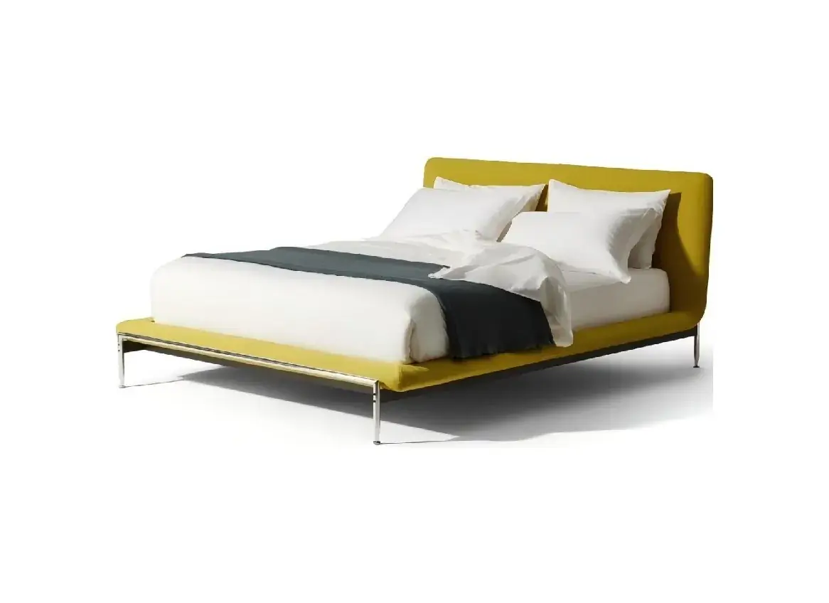
If the living room uses olive green, the bedroom could connect through the surrounding warm neutrals and a related metal tone. It does not need an olive chair added solely to justify the relationship. Repetition is helpful when it supports the room, and distracting when it becomes another item to purchase without a useful role.
Give wood, stone and rugs a clear place in the furniture palette
The upholstered pieces are only part of the scheme. A broad cabinet front, a patterned stone top or a large rug can change the balance as much as another colour of fabric. Compare their visible area and position, particularly where living and dining share a view.
The light-oak sideboard connects materials across the dining area
The Rounded Marble Top Light Oak Storage Sideboard brings light oak and natural marble into a listed 180 × 45 × 80 cm cabinet. This can be considered as a lighter storage element beside a stronger sofa colour. Its stone top also introduces pattern, so review it alongside any retained stone that will be seen nearby.
Do not approve a stone selection from the general word “marble” or expect its markings to repeat like printed wallpaper. Establish what material and appearance are being proposed for the actual order. A very expressive top might become the dining area's main pattern, leaving the chairs and nearby textiles quieter.
The Textured Bubble Solid Color Living Room Rug is described in beige-grey tones, with a polyester/acrylic construction and a 200 × 300 cm size. It offers a different kind of interest: surface texture rather than a large multicolour print. Compare its tone against the chosen sofa fabric instead of assuming all neutral rugs sit equally well beside off-white or olive.
Its listed 25 mm pile is also part of the room decision. The rug needs to work beneath and around the selected furniture, not simply complete a colour board. Keep door movement and the intended placement of sofa feet in view when deciding how much of its textured surface will be exposed.
Spread the rug and upholstery references out in roughly the roles they will occupy. A tiny green swatch surrounded by a large photograph of pale flooring can make the olive scheme seem quieter than the finished sofa will be. Conversely, filling a presentation board with the mustard fabric can exaggerate its presence when most of the bed will be covered. Include an elevation or room view that shows the approximate visible areas, then use the physical samples to judge the actual colours.
A distributor presenting several coordinated rooms can keep these two forms of information separate: the room view explains proportion, while the identified samples explain the materials being offered. Neither should silently substitute a different green, yellow or oak finish because its photograph looks more convenient. If a material changes, show the affected room combination again rather than accepting the replacement as an isolated swatch.
| Furniture direction | Let this element lead | Review beside it |
|---|---|---|
| Olive curved sofa in living | The broad green upholstery and rounded form | Retained floor, rug tone and any dining storage in the same view |
| Off-white modular sofa in living | The relationship between fabric texture and its wood shelf | Wall white, darker furniture and the selected rug sample |
| Mustard upholstered bed upstairs | The headboard and exposed frame colour | Made-up bedding, bedside furniture and bedroom lighting |
| Light-oak marble-top sideboard in dining | The wood front and the actual stone appearance | Other visible stone, chair finishes and the adjacent living room |
Approve the whole-house colours in the light they will live in
A material board photographed in a showroom is a useful record, but it is not the room. Put the proposed fabric, wood and other available finish samples beside the retained finishes. Look at them during daylight and with the evening lights switched on. Keep the direction of the fabric and the angle of a glossy sample consistent when comparing alternatives.
Benjamin Moore's whole-house colour guidance also stresses connected colours and the influence of natural and artificial light. That is general colour-planning advice. The furniture decision still needs the actual proposed materials viewed in the rooms where they will be used.
For a home being supplied in phases, retain the approved references after the first room is installed. Record which sample belongs to the olive sofa, which finish belongs to the sideboard and which items remain undecided. The furniture material schedule can keep those decisions readable when a later bedroom order is placed.
Before closing the selection, walk the same route through the house again with the room proposals in hand. Look for a piece that feels unexplained, a near match that is less convincing than a contrast, or a strong colour repeated where it adds nothing. Adjust that specific relationship. The aim is a home whose rooms belong together and still give you a reason to enjoy each one separately.