Keep a Furniture Material Schedule Clear Across Different Surfaces
Two pieces can look as though they belong together without being made from the same materials. That is the starting point for a furniture material schedule. Record what each visible surface is, which component it belongs to and which physical reference defines the selected appearance. Keep colour coordination separate from construction. A warm wood tone, a leather panel and a stone top need different descriptions even when they form one quiet palette.
For a whole-house order, HEZEN CASA offers useful combinations to work through: leather with solid wood, travertine with metal, a leather-covered writing desk and a sideboard pairing oak with marble. A schedule built around these actual combinations helps the designer communicate the intended relationship between pieces without turning a shared colour into an unsupported promise of identical finish.
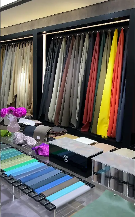
Organize the furniture material schedule by the surface you touch
Begin with the parts a person sees, handles or cleans. A sofa has more than an upholstery label; a table has more than a top colour; a cabinet can have one finish on its exterior and another material inside. Use the product's listed information as the starting point, then identify the detail the supplier needs to confirm for the selected order.
For a designer reviewing several rooms, it helps to keep a small palette overview alongside the item-level material record. The overview shows the intended family of colours. The individual records define the actual surfaces. Do not ask the overview to replace those records. A neutral palette can contain very different textures and cleaning requirements.
Nappa leather and the sofa frame belong in separate entries
The Burgundy & White Nappa Leather Curved Sectional Sofa is listed with Nappa leather, a curved solid wood frame and overall dimensions of 320 × 180 × 85 cm. Its two-colour treatment is a useful reminder that even one upholstery material can require more than one approved reference. Identify the location of each selected colour rather than describing the whole piece as cream or burgundy.
Keep the visible wood treatment separate from the leather decision. A leather swatch cannot approve the wood finish, and a photograph of the frame cannot establish the exact leather surface treatment. Ask for the appropriate information for each component. If the original design is being adapted, mark the proposed change as a request until it has been confirmed.
This matters when a buyer wants a coordinated lounge rather than a single statement sofa. A chair might sit comfortably within the same colour family while having a different sheen, grain or upholstery finish. The schedule should describe the intended relationship honestly: coordinated, deliberately contrasted or required to match an approved reference.
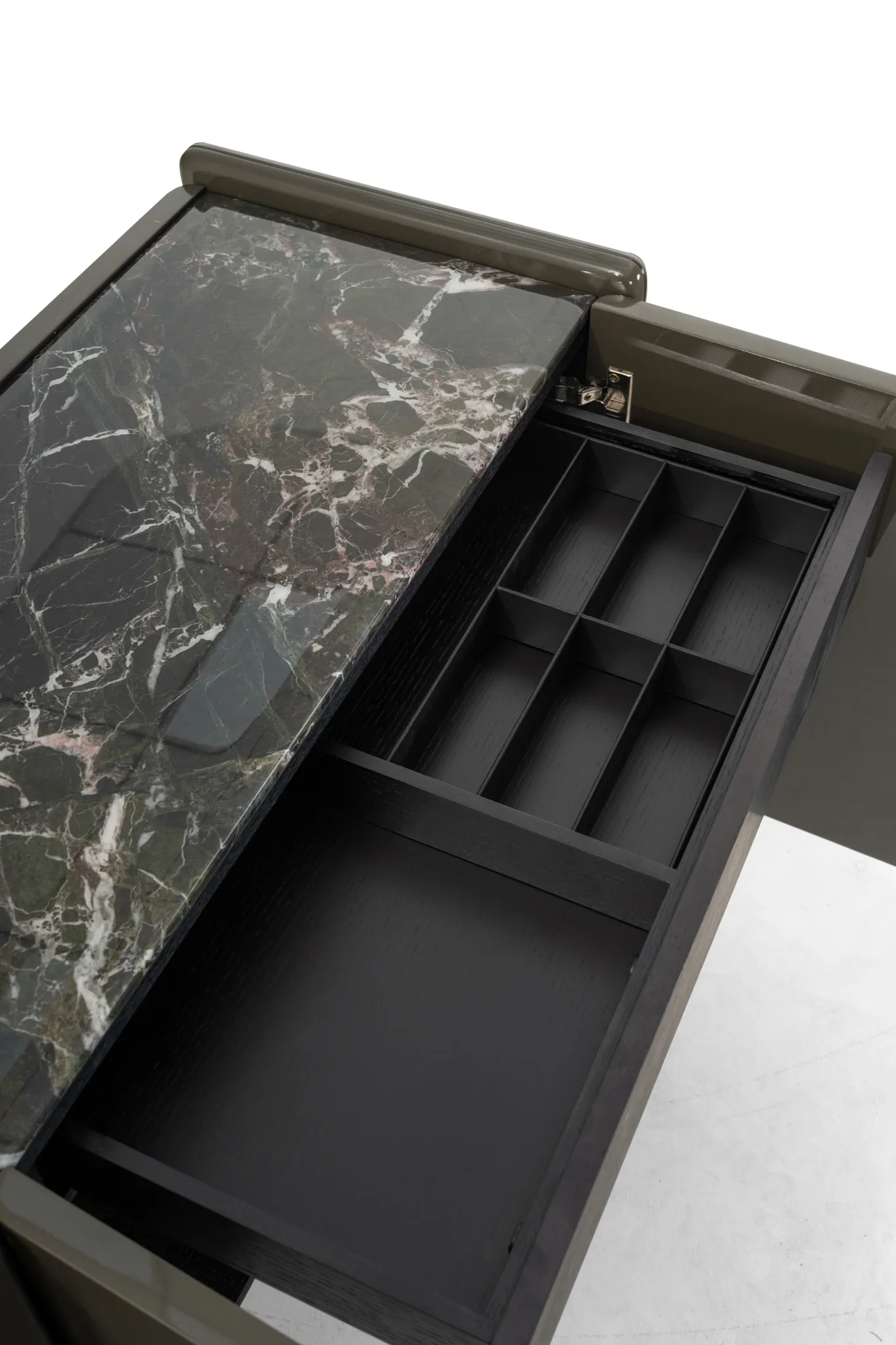
Match material samples to the surfaces being selected
A material schedule is easier to use when its descriptions acknowledge the differences between materials. Natural stone, a textile and a coated metal surface do not vary in the same way. Give the supplier a clear selection question rather than sending a colour name and assuming it defines every characteristic.
Travertine needs a surface reference as well as a colour description
HEZEN CASA's Irregular Travertine Stone Metal Coffee Table is listed at 120 × 60 × 40 cm, with travertine stone and metal. The table is a good example of why “beige” is not a complete material entry. Tone, texture, visible openings, treatment and the agreed edge appearance can all influence how the top reads in the room.
Use a representative image to discuss the direction, then establish what the selected physical reference can reasonably demonstrate. A small sample cannot show the distribution of features across a whole irregular top. If the particular appearance is important to the buyer, agree a suitable method of reviewing the proposed stone selection.
The metal support needs its own finish reference. Do not assume it should take the same sheen as the stone. In a quiet interior, a strong reflection from the base may matter as much as a change in the top's tone. Evaluate the proposed pairing under the intended room lighting before treating it as a completed design decision.
The leather writing desk combines appearance with everyday contact
The Two-tone Leather Vanity Writing Desk with Drawers is listed at 120 × 55 × 75 cm, with leather and solid wood. For a buyer choosing it as a writing desk, note the areas where hands, papers and objects will sit. A decorative leather treatment can be part of the appeal, but the order needs clarity about which surfaces receive it.
For a vanity setting, the same piece raises a different discussion about the objects placed on the surface and the care information the owner will need. The schedule should identify the material, not promise resistance to cosmetics or liquids without supporting information. Record any performance requirement as a question for the supplier to address.
A contractor furnishing several rooms may want the desk to relate to a leather bed or sofa. Keep that as a coordinated selection unless the same physical material has actually been specified and accepted for both. Product descriptions that use the same material word do not establish identical thickness, finish or colour behaviour.
Oak and marble should remain identifiable on the sideboard
The Rounded Marble Top Light Oak Storage Sideboard is listed at 180 × 45 × 80 cm. Its description pairs light oak and natural marble. Record the oak appearance and the stone appearance as separate decisions, then assess them together. Their relationship is part of the design, but their natural variation should not disappear from the record.
If another dining-room piece uses dark wood, decide whether the contrast is intentional. Trying to make several unrelated woods look nearly identical can be less convincing than using a clear difference. That is a design judgement to resolve with samples in the room, rather than a technical guarantee the supplier should be expected to infer from the word “matching.”
Also identify the edge where the materials meet. A buyer may focus on the large surfaces and overlook the small junction visible at eye level. A photograph of an approved corner or edge can help communicate that detail, provided its item and finish references stay attached.
Think about how these surfaces will be viewed in the finished room. A person standing beside the sideboard sees its top and front together; someone seated across the dining table may mostly see the front. A material choice that looks quiet in one view can look much stronger in another. Include both views in the discussion if the furniture sits prominently between connected spaces. This is a reason to review the actual arrangement, not a reason to claim one photograph proves the result.
Write colour relationships in ordinary language
Short, specific descriptions are useful: the sofa leather should be the warmest neutral in the room; the sideboard wood should contrast with the floor; the coffee-table base should be visually quieter than the stone top. These statements explain the intention. They still need material references before they become approvals.
Avoid treating a screen image as a colour standard. Camera exposure, surrounding surfaces and room lighting can all change the impression. For a remote buyer, compare labelled physical samples where feasible and request consistent photographs for the discussion. Ask which sample belongs to which item rather than assuming several similar beige squares are interchangeable.
Furniture maker BSA's material selection guidance makes the useful distinction between a visible finish and the material beneath it. The principle applies to the schedule here: identify the relevant surface and construction separately. It does not establish the construction of a HEZEN CASA item that has not been confirmed.
Keep sample references attached to the component
Give a selected sample a clear reference and connect it to its intended location. If a sofa uses two leathers, record two locations. If the desk uses leather on one surface and another treatment elsewhere, identify those areas. A small marked image can make the relationship easier to understand than a long sentence.
When a sample changes, review the adjoining materials. Replacing a warm leather with a cooler one may alter the relationship to the oak sideboard or stone table. That does not mean every piece must change; it means the coordinated decision deserves another look. Record which relationships have been reviewed so an earlier palette image is not mistaken for the final selection.
Keep a distinction between an accepted range and an exact target. With the travertine coffee table, the buyer might accept variation within an agreed selection. With the two-colour sofa, the boundary between upholstery colours may need a much more specific drawing. Write those different expectations beside the relevant material entry. One broad statement that all finishes must match the sample can obscure what is actually being accepted on four very different furniture surfaces.
Use HEZEN CASA's whole-house furnishing service to develop the actual combination, and keep the broader leather-colour coordination discussion with any leather-specific questions. The material schedule itself should remain a clear record of the surfaces selected for the present order.
Review the palette where the furniture will be used
A family lounge, a guest bedroom and a formal dining room do not need the same texture just because they belong to one house. A soft-looking upholstery may work as the main texture in a lounge, while a stone top gives the dining area a different emphasis. Let the room's use influence the material decision rather than repeating every finish mechanically.
For the four examples above, put the leather, wood, stone and metal references together and review the whole group. Then check the individual item records again. You should be able to move from the overall room impression to the precise material location without guessing what a sample means.
Keep a photograph of that agreed grouping with the sample references visible. It can help explain the relationship later, while the physical samples and item records remain the basis of the actual selection.
The schedule is ready when someone outside the design conversation can identify the selected surface, its reference and its place on the furniture. A coordinated interior needs that clarity more than it needs every material to look identical. Keep the relationships deliberate, and keep the evidence specific to the piece being ordered.